
News From the Design Team at Gain ⚡️
Today we unveiled a new look for Gain. Our team is always busy adding new features, and although that is great for our users, it presents a challenge in terms of design. How can we keep adding functionality to Gain without cluttering the user interface and making it feel overwhelming? To our Design team, how our users feel while using Gain is just as important as what they can do in Gain. That’s why we took some time to improve our platform’s look and feel, optimizing not only for the features Gain offers today but for all the new exciting features that are yet to come!
1. Our Design Vision for Gain
When developing a design vision for Gain, we got inspiration from our users. Our users are content creators. They’re marketing agencies and teams creating social media and marketing content either for external clients or internal stakeholders. In any case, they not only need to manage their content, schedule it, and publish it. For them, how they present their content to their approvers is crucial. That’s how we came up with our vision of making Gain a canvas for your content.
By thinking of Gain as a canvas, our Design team has produced a cleaner UI (user interface) – for both content creators and approvers – where the content can truly shine. For content creators, the new design had to provide a space to work where all the controls and features that they need to use are readily available but don’t distract from the content. For approvers, the new design had to showcase the content beautifully while still providing all the additional information and activity pertaining to it. In a nutshell, we have to make sure Gain lets our users’ content shine from the moment they create it to the moment the client sees it.
2. Using Color to Simplify the User Interface
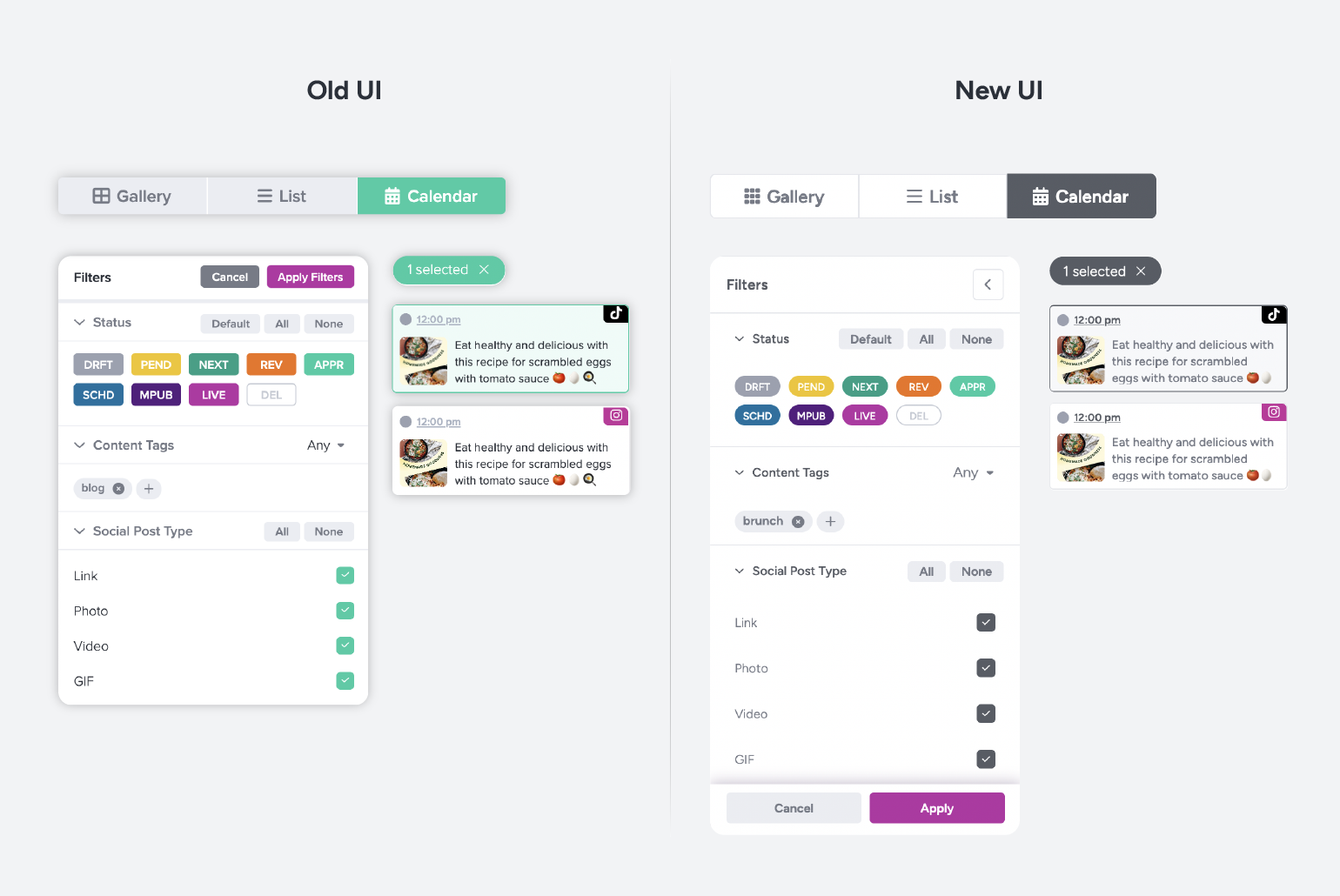
By now, you’ve most likely noticed a trend toward minimalism in all aspects of life. (Really, who hasn’t Marie Kondo’ed their home or at least their desk at this point? 😄) Product design is no exception. We apply minimalism to Gain’s interface as a way to put the focus on what is most important. And we started with colors.
Before the redesign, the Gain interface used a dark eggplant color as the anchor for the entire experience. It showcased the Gain logo and branding, and displayed key actions at an account level, such as switching workspaces, approving content, reviewing notifications and tasks, and accessing your personal settings.
But we want our users’ content to be king, not our own branding! That’s why we went back to basics. To make Gain a blank canvas for your content, we embraced white as our primary color.
White provides a clean and simple background that allows our users’ content to take center stage. Now, when you look at Gain, the eye goes to the content first and the actions you want to take, second.
We also simplified the color system used in buttons and selectors. You’ll see fewer colors and more shades of gray. This change aligns with our “canvas for your content” vision, and more importantly, it helps your brain move intuitively to the next step in the user flow.
All of this makes for a more focused, and dare we say, zen user experience. 🧘🏽
3. Into the Nitty Gritty
A clean, focused experience is crucial for a product like Gain, which offers our users so many actions to choose from on any screen in the user’s journey. That’s why color was just the beginning. Here are some specific details for the design geeks in our audience.
Typography and Spacing
Gain has a new font! After many iterations, our Design Team chose Figtree to replace Proxima Nova. What did we like about it? It’s easier to read, but it still has personality. Plus, we revised font sizes, padding, and spacing to allow for faster text scanning and reduce cognitive load. We know our users have hectic work schedules, so we aim to enhance their productivity in every single detail.
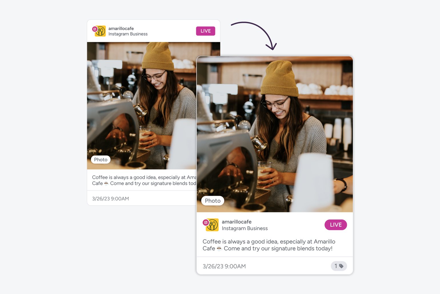
Content Cards
We stylized our user content containers with sleek rounded corners and revisited the hierarchy of the information they display. Images look better than ever in Gain!
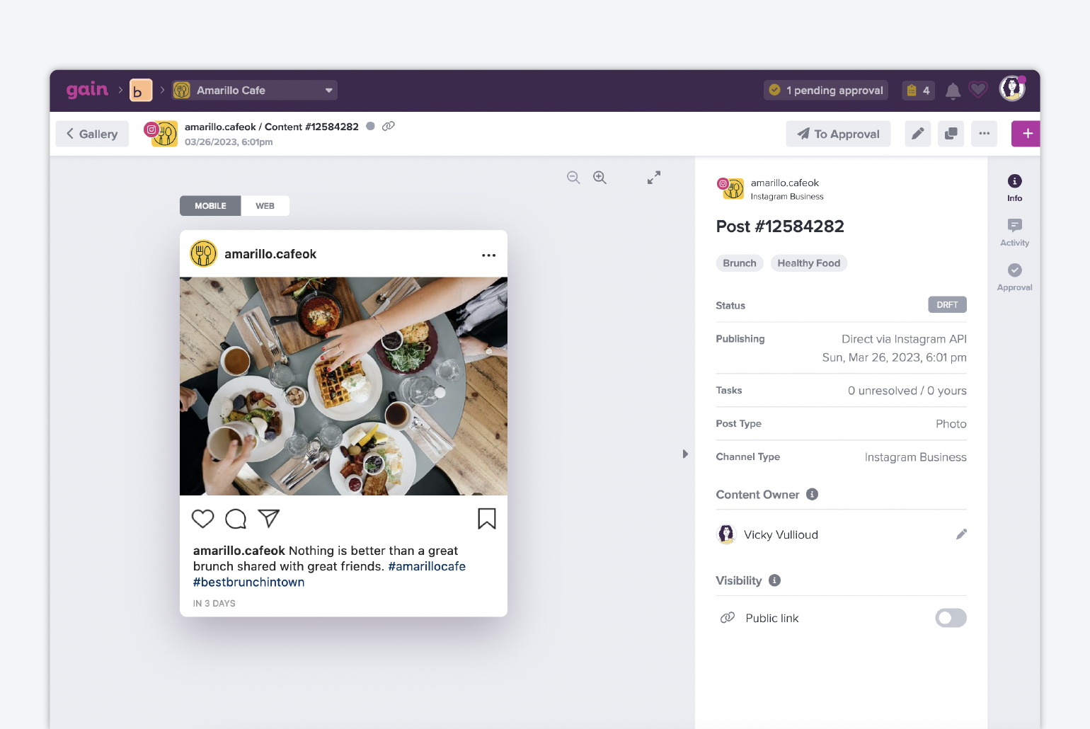
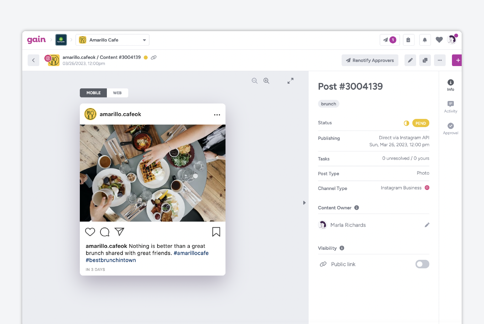
4. The Approver Experience
We have many ex-agency employees in Gain. We know how important presentation is for clients and stakeholders. You want them to be able to see your content displayed beautifully, to focus on the right thing when giving feedback, and to feel cared for. A few simple changes in the Approvals page made quite a difference in the approver experience!
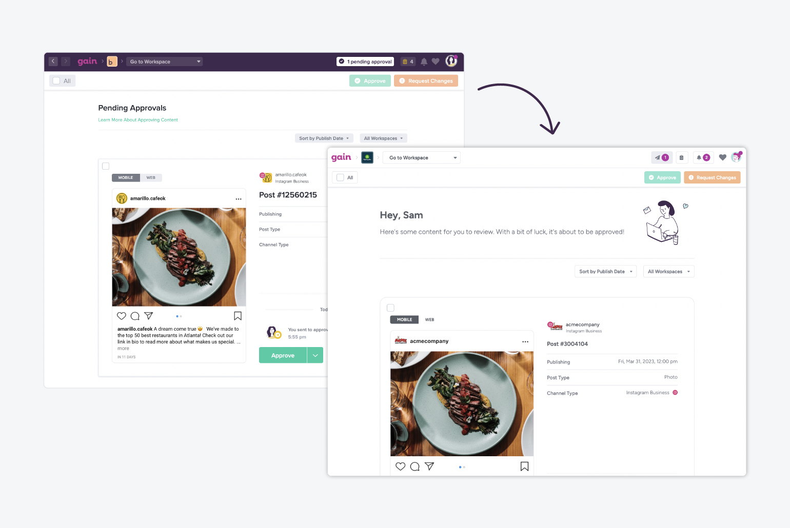
As you can see, simplifying colors in the UI really brings the spotlight to the content. And something as simple as adding personalization (with name, and different messages and illustrations that vary depending on the time of day) creates a warmer, more welcoming environment to enhance the easy approving experience in Gain.
What’s Next for Gain’s UI?
Tons! Now that we’ve given some TLC to Gain’s aesthetic, we can start working on structural and hierarchical optimizations to simplify the user experience. To make Gain even easier to use, we’ll focus on presenting actions only as they’re needed. Our Design team will continue to work really hard so you can work better, faster, and with a big smile on your face because you feel so productive! 🐝 👏🏽
📣 Special shoutout to the Gain Design team: Cynthia, Daniel, and Vicky! Thanks for all your hard work to make Gain better for our users every single day. 🫶🏼