When we started Gain, we reinvented the content approval process for agencies and brands with the goal of helping them improve communication, save time, and build stronger relationships.
Every new feature we’ve launched since has served to empower our users and make their lives easier.
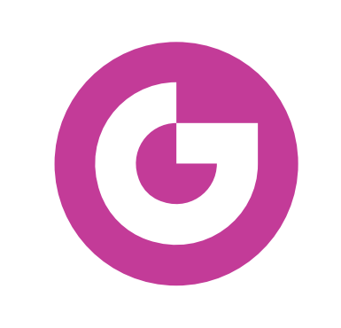
A few weeks ago, when we announced our big collaboration update, we also introduced a new Gain logo and branding.
Now, we want to share our story behind our rebrand and where we’re heading.
Old logo
New logo
Our logo: a new Gain
Gain has changed a lot over the years, but our brand has lagged behind our growth as we’ve refined our solution.
Before, our logo only represented how Gain helped teams get organized – similar to a folder.
We needed the logo to represent how Gain improves team collaboration, communication, and the client relationships as well.
We decided it was time to update our logo to showcase that Gain offers more than just a way to organize the social media content approval process.
Today, Gain also allow teams to collaborate and keep all sorts of conversations and content in one place.
Most importantly, Gain saves teams time, and our logo should reflect that in addition to our brand goals and personality.
Initial sketches
Our new look and new logo represent the core personality of our company, our brand, our product, and our team, which includes:
Simplicity – We simplify the time-consuming, day-to-day tasks so our users can manage multiple projects, campaigns, and clients with transparency and ease.
Friendliness – We support our users in a fast and friendly manner and provide them with tools to efficiently and effectively communicate with their team members and clients.
Creativity – We are constantly innovating and designing new solutions that empower our users to create, collaborate, and share ideas with each other.
Bringing it all together
Our talented designers, Cynthia Guzmán and Vicky Vullioud, helped bring the new logo and branding to life with fresh colors and illustrations that represented our values: original, caring, approachable, and fun.
Illustrations: We translated our brand goals and personality into simple, clean, and approachable hand-drawn illustrations that will continue to evolve as Gain grows.
Color palette: We chose bright and friendly colors that matched our existing branding but reflected our brand personality more appropriately.
Typography: For titles, we selected the Kefa font. We are moving away from only focusing on technology to focusing on solving our users’ problems. We wanted a font with a more human-like quality, and the slab-serif origins represent print publications with a human touch, making it perfect for our brand.
For the body text, we selected the Graphik font because it is functional yet elegant. The font moves effortlessly between being a central design element and playing a supporting role in a wide range of projects and applications.
Where Gain is headed
We’re so excited to unveil our rebrand and offer our users a friendly place to collaborate and keep all conversations and content in one place.
Our goal is to help busy teams save time, and our new branding reflects that in addition to our brand goals and personality.
So marketers, agencies, and anyone working in teams: Stay tuned!
We have many more exciting developments in the works that will improve team and client collaboration on other types of content, and we can’t wait to share them with you.
Going through a redesign is never easy – especially with a small, distributed team. Get the tips and tools our team used to plan and collaborate on a successful redesign here. 🙌

