")
Every business, however small, should have a social media style guide.
The reason is simple: without one, every person on your team makes their own judgment calls about tone, visuals, hashtags, and whatever else you’re posting. Sometimes those calls are right. Sometimes they aren’t. Over time, that inconsistency can quietly erode how professional and trustworthy your brand looks online.
If you don’t want that to happen to your business, read this guide. We’ll teach you how to create a social media style guide from scratch. Plus, we’ll share a few real-world examples so you can see what different approaches look like in practice and what’s worth borrowing for your own.
What Is a Social Media Style Guide?
A social media style guide is a document that defines how your brand shows up across social platforms, covering voice and tone, visual standards, platform strategy, writing mechanics, and the process for getting content approved before it goes live.
It’s not the same as a general brand guide, which tends to focus on logo usage and color palettes. A social media style guide is operational. It tells people what to write, how to write it, where to post it, and who needs to sign off before it reaches your audience.
Why Your Team Needs One
If you want your social media posts to look like they were posted by a bunch of random people, then sure, you don’t need one. But if you want your content to have a consistent tone, you need to have your social media style nailed down.
A good social media style guide gives you:
- Consistency across platforms and team members, whether you have two people or twenty
- Faster onboarding for new hires, freelancers, and agencies who need to hit the ground running
- Fewer revision rounds because everyone starts from the same baseline
- Brand protection, since a shared standard makes it harder for off-brand content to slip through
What to Include in Your Social Media Style Guide
There’s no right or wrong answer when it comes to social media style guides. You can create a two-page document if your brand is small and only one or two people work on the content. You can also make it highly specific and detailed.
However, there are certain elements you shouldn’t miss:👇
1. Brand Voice and Tone
Start with personality. Describe your brand’s voice in three to five concrete words — not generic ones like “friendly” or “professional,” but words that actually distinguish you. Then show what those words mean in practice with side-by-side examples: what we say, what we don’t.
Tone can also shift by platform. Your LinkedIn voice might be more measured; your Instagram voice can be warmer and more direct. Define those variations explicitly rather than leaving them to interpretation.
2. Platform Strategy
List every platform your brand is active on, explain the role each one plays, and define a realistic posting cadence for each. This section should answer a question that often creates confusion for teams: what is this platform actually meant to achieve for us?
Each channel should have a clear purpose. Instagram may be where your brand focuses on visual storytelling and product discovery, while LinkedIn may be reserved for thought leadership, company updates, and professional credibility.
When the purpose of each platform is clearly defined, your team can make stronger content decisions. They know what belongs where, how often to post, and how to adapt the message without making every channel feel identical.
3. Visual Identity
Cover things like:
- Logo usage rules
- Color palette
- Typography
- Photography style
- Graphic templates
Also, don’t forget to include image dimension specs for each platform, or link to a reference document that stays updated. This section exists to prevent the wrong logo version from appearing on a cover photo or a visually inconsistent graphic from going out under your brand name.
4. Writing Style
Another important section to include is writing style. These are the mechanical rules that keep copy consistent across contributors, including capitalization, punctuation, whether to write out numbers, and how to format dates and times.
Cover emoji usage too, including whether emojis are allowed, how many can be used per post, and any brand-specific preferences.
It’s also a good idea to define your hashtag strategy. Include how many hashtags to use per platform, which branded hashtags are always required, which community hashtags to use, and which ones to avoid.
Small decisions, like whether to use sentence case or title case, or whether to end captions with a period, might seem minor. But when ten different people are writing posts throughout the year, those small inconsistencies add up and can make the brand feel less polished than it actually is.
5. Content Types and Approval Process
Define the types of content your brand publishes, such as:
- Educational content
- Promotional content
- Community-driven content
- Behind-the-scenes content
- Campaign-specific content
Then map out who creates and approves each type. You should also document your approval process, including:
- Who reviews content before it goes live
- The order in which reviews happen
- Where sign-off is recorded
This is the section most style guides skip. Without it, the guide tells people how to create content, but does nothing to ensure that the content is actually reviewed before it’s published. For teams managing multiple contributors, or content that touches legal, compliance, or senior leadership, that missing step is where things often go wrong.
How to Build A Social Media Style Guide: Step by Step
Building a social media style guide doesn’t have to be a big project. If you approach it methodically, you can have a working first version in a few days. Here’s how: ⬇️

Step 1: Start With Your Brand Foundation
Before you open a blank document, check what already exists. Most businesses have some form of brand guidelines, even if it’s just a logo usage sheet and a color palette. Pull from that.
Your social media style guide should extend your existing brand identity, not contradict it. Gather your mission statement, any existing voice and tone notes, your logo files, and your color and typography standards. This will give you the foundation to build from.
Step 2: Audit Your Current Social Presence
Look at the last 30 days of posts across every platform you’re active on. Note where things feel inconsistent — does the tone shift between posts? Are different image styles showing up? Are hashtags used randomly or not at all?
The audit will tell you exactly where the gaps are, so you’re building a guide that fixes real problems rather than documenting things that are already working fine. It’ll also give you a baseline to measure against once the guide is in place, so you can see whether consistency improves over time.
Step 3: Map Your Platforms and Define Their Purpose
For each platform you’re active on, write down why you’re there and what you use it for. Then set a realistic posting cadence for each. This step will give you a natural opportunity to question whether every platform you’re on is actually earning its place.
If you can’t clearly define the purpose of a channel, it’s worth asking whether your team’s time is better spent elsewhere.
Step 4: Document Your Writing Rules and Visual Standards
This is the bulk of the guide. Work through each element systematically:
- Voice and tone
- Platform-specific guidance
- Image sizing
- Logo usage
- Photography style
- Caption formatting
- Emoji use
- Hashtag strategy
- @mention rules
The key is to use real examples wherever possible. In other words, show a caption that gets the tone right alongside one that doesn’t. Abstract rules are easy to interpret loosely; examples make the standard concrete. Where you can, pull real posts from your own channels to illustrate what good looks like, rather than writing hypothetical scenarios.
3 Real-world Social Media Style Guide Examples
We’ve covered the sections you should include in your style guide and how to build it step by step. Now, let’s look at a few examples from real companies to see how everything comes together.👇
1. Society of Women Engineers (SWE)
SWE’s social media style guide is a good example of how to build a guide that’s practical without being overly rigid. It’s written in a friendly, accessible tone that makes it easy to follow.
✨ What we like about it:
- Platform purpose comes first. Before any rules are introduced, the guide defines what each platform is actually for. Facebook is for storytelling and campaigns. Twitter is for conversation and real-time interaction. Instagram is the creative platform. LinkedIn is for professional connections. Anchoring every channel to a clear purpose means contributors always know what kind of content belongs where.
- Quality over quantity is a guiding principle. Rather than setting a rigid posting schedule, SWE makes the point that one focused, well-crafted post is worth more than five unfocused ones. It’s a simple idea, but an important one for any team that’s tempted to post just to stay visible.
- Social mechanics are explained clearly. The guide breaks down the difference between sharing, liking, commenting, retweeting, and quote tweeting in plain language — useful for anyone who’s newer to managing a brand account and not entirely sure which actions drive the most reach.
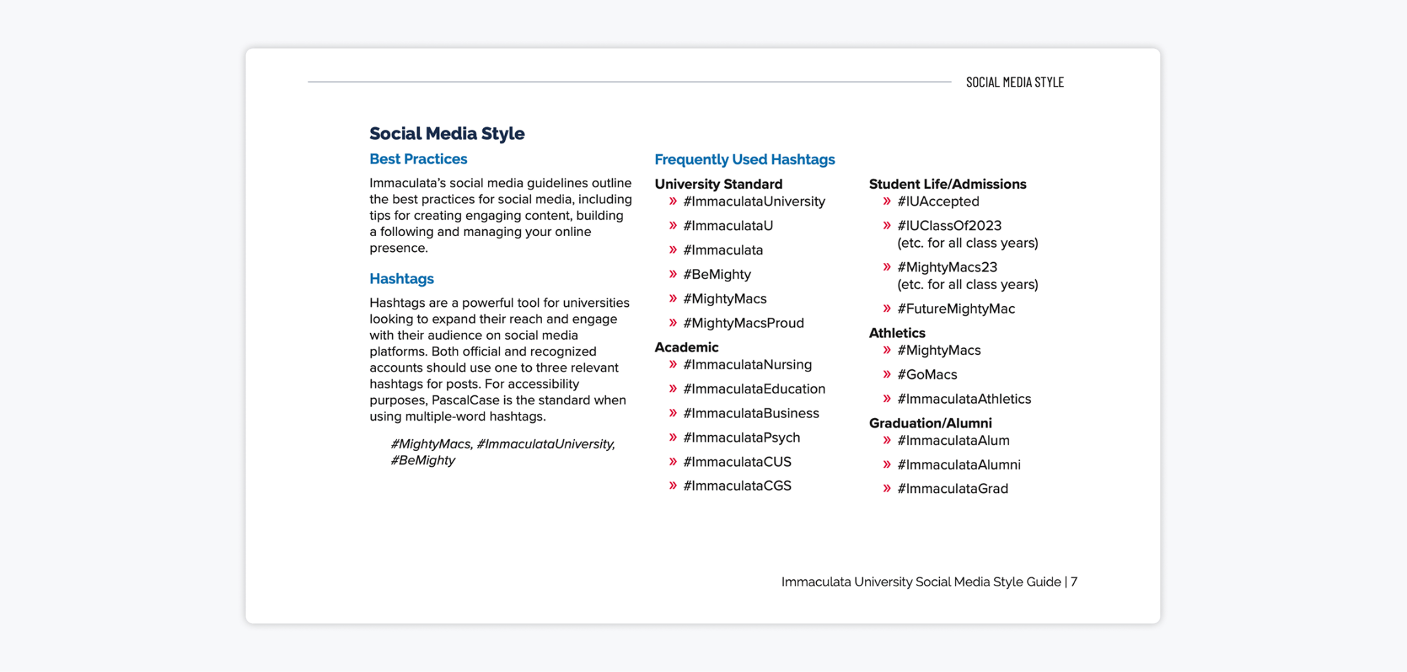
2. Immaculata University
Immaculata University’s guide is one of the more thorough examples out there, and it’s worth looking at closely if you’re building a guide for a team with multiple contributors across different departments. It covers both the strategic and the granular, which is a combination that a lot of guides get wrong.
✨ What we love about it:
- The hashtag library is ready to use. Rather than offering vague guidance on hashtag usage, Immaculata provides a categorized list (academic, athletics, student life, admissions, alumni), so contributors can pick the right ones without having to think too hard. That kind of ready-to-use reference saves time and keeps usage consistent.
- The YES/NO caption examples are especially effective. The mentions and reposts section shows a correct and incorrect caption side by side with the real copy. This is exactly the kind of concrete guidance that changes how people actually write, rather than just telling them what to do in theory.
3. DEKRA
DEKRA’s social media style guide is a strong example of a brand translating a detailed corporate identity into practical, platform-specific rules. It doesn’t just explain how the brand should look online; it shows how that identity should adapt across Instagram, LinkedIn, Facebook, Twitter, and YouTube.
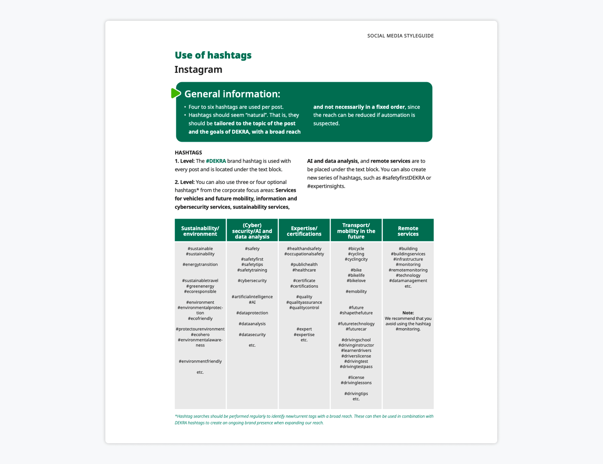
✨ What we love about it:
- The visual rules are practical. The guide gets very specific about image sizes, free space, logo placement, typography, colors, and layout elements. For example, it defines DEKRA’s digital colors, including DEKRA Logo green, dark green, light green, white, black, and accent colors, and it specifies Noto Sans as the font for digital media.
- Hashtag rules vary by channel. Rather than giving one generic hashtag rule, DEKRA breaks usage down by channel. Instagram uses the required #DEKRA brand hashtag plus optional corporate focus-area hashtags and, where needed, event, seasonal, location, or campaign hashtags. LinkedIn, Facebook, Twitter, and YouTube each get their own hashtag ranges and recommendations.
- It covers real production needs. DEKRA includes guidance for static posts, carousels, stories, reels, videos, and multi-image posts. It also gives practical reminders like keeping key content inside safe zones, using natural and realistic imagery, avoiding heavily edited images, and placing the logo only at the beginning and end of videos instead of keeping it on screen the entire time.
FAQs
A social media style guide should be long enough to answer the questions your team actually has, but short enough that people will use it. Most guides are around 5 to 25 pages. A small team may only need a few pages, while larger teams often need more detail around content approvals, visuals, and platform rules.
At a minimum, once a year. Also, review it after any rebrand, significant team change, platform update, or campaign that surfaces new guidelines. Treat it as a living document, not a one-time project.
A brand guide defines your overall brand identity, including your logo, colors, typography, mission, and visual standards. A social media style guide is more practical and platform-specific. It explains how your brand shows up day to day on social media, including tone, writing rules, hashtag use, posting cadence, and approvals. You need both because they serve different purposes.
The One Thing Most Social Media Style Guides Leave Out
Most guides are excellent at defining the standard. Very few define how the standard gets enforced.
A style guide without a content approval process is a set of rules with no accountability mechanism. It tells your team how content should look and sound, but it doesn’t guarantee that any given piece of content is reviewed by the right people before it’s published.
For teams managing multiple contributors, agency partners, or content that touches legal, compliance, or brand teams, Gain is the perfect tool to close that gap. Gain is a content approval platform built specifically for marketing teams and agencies that allows you to send your social posts, files, documents, and web content through a structured review process before anything goes live.


")
